After nearly a decade in operation, Run reached a pivotal moment in its evolution as a retail brand. The company had built a loyal following among dedicated runners, with stores in Bree Street in Cape Town and Durbanville serving the community for roughly ten and six years respectively. Both locations had established the brand successfully, but as the business matured it became clear that the retail environment needed to evolve alongside it.
When I became involved in the next phase of the brand’s retail development, the intention was not to reinvent the concept, but rather to refine and elevate it. Run is a specialist retailer with a very clearly defined audience. Unlike general sports stores, their entire offering is focused on running. Within that niche, they serve two distinct communities: road runners and trail runners.
This distinction became the central organising principle of the design.

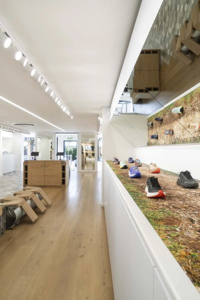
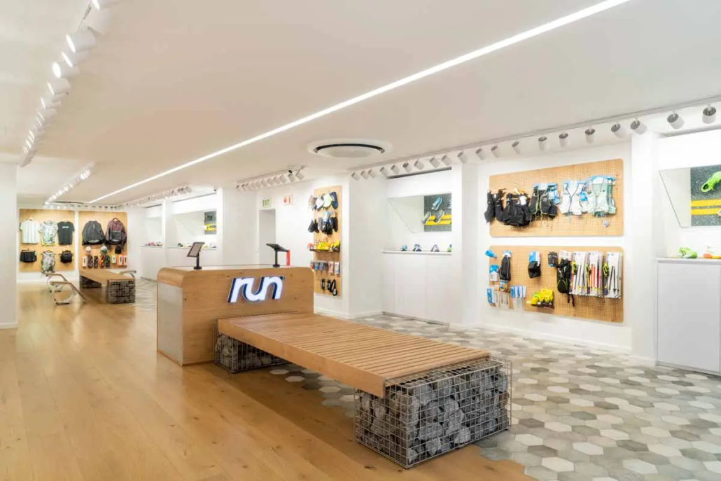
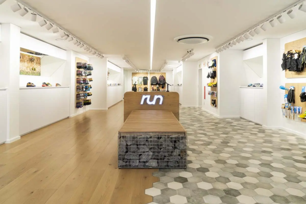
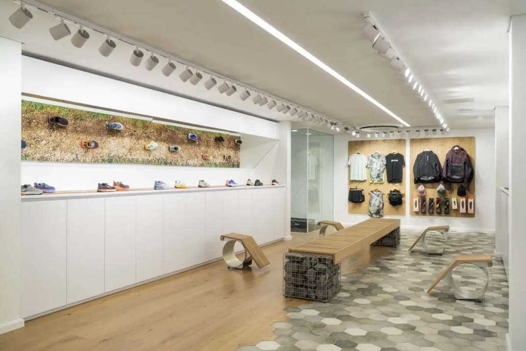
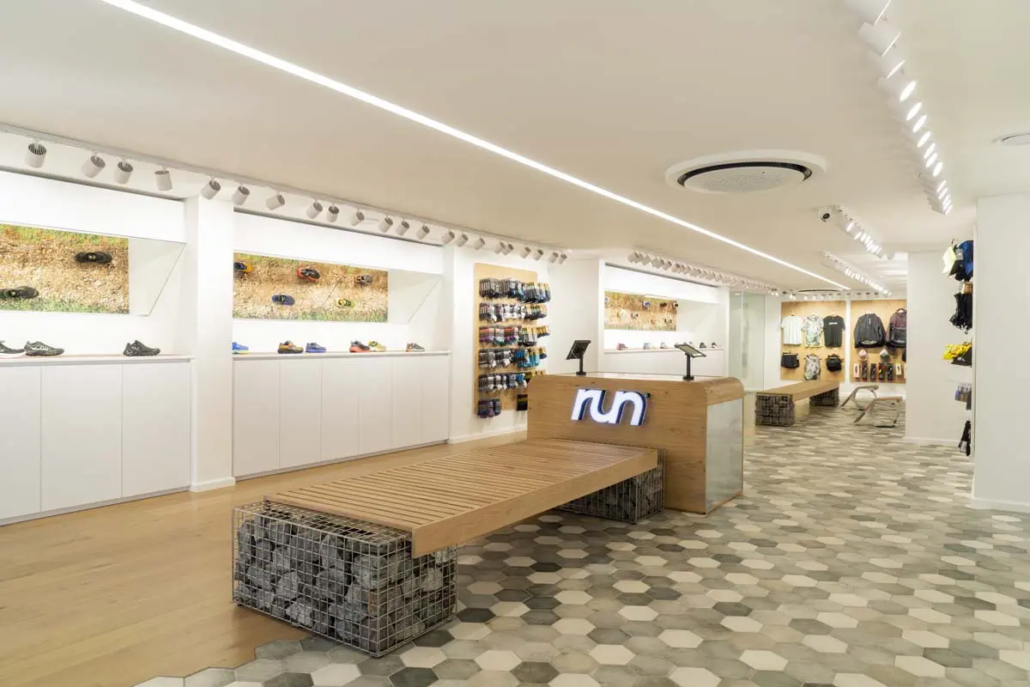
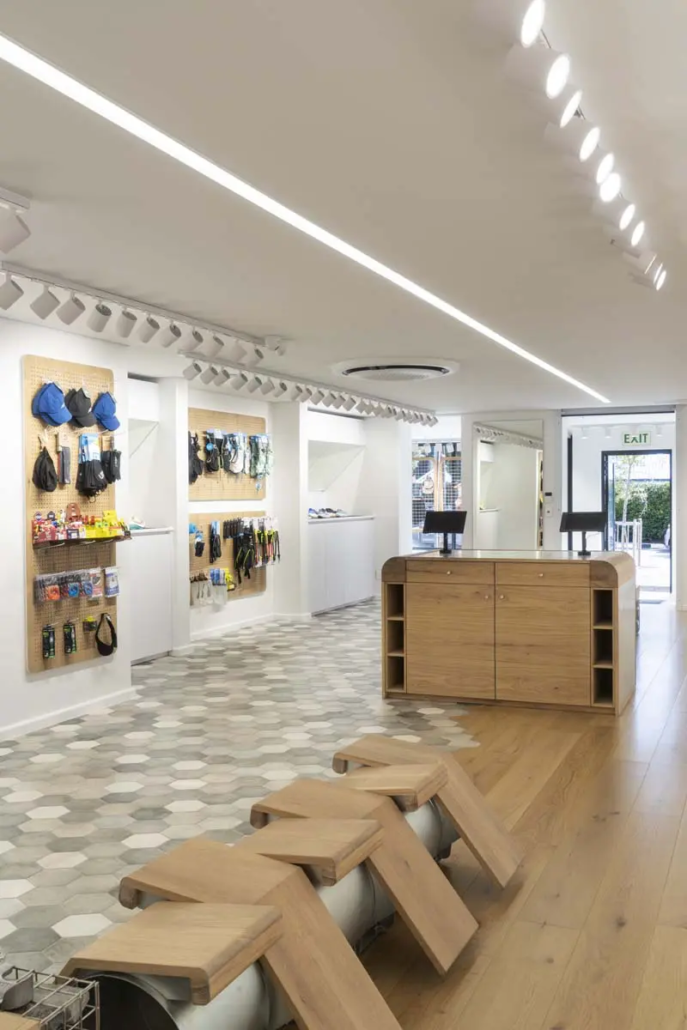
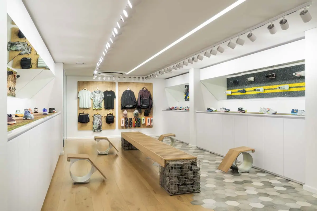
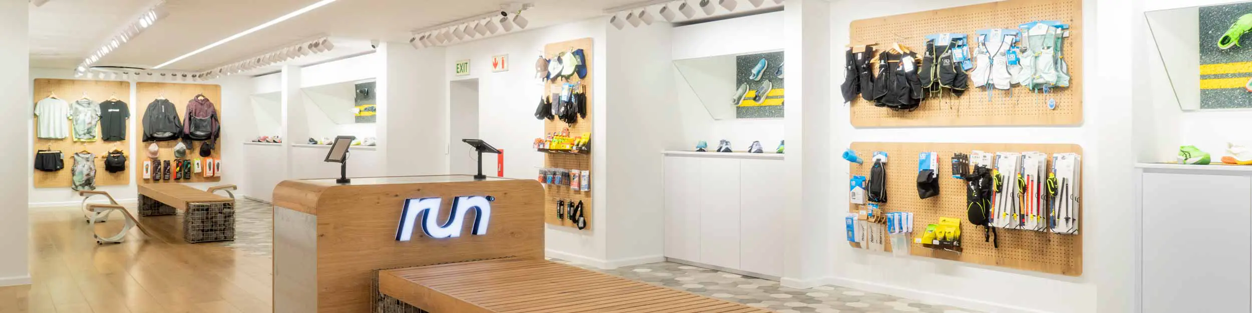
From a spatial perspective, the store is deliberately simple. The retail floor is divided cleanly into two halves one dedicated to road running, the other to trail running. Rather than relying on signage or complex merchandising strategies, the distinction is embedded directly into the architecture of the space. The floor plane itself becomes the guide, allowing customers to instinctively orient themselves the moment they enter the store.
Project Overview
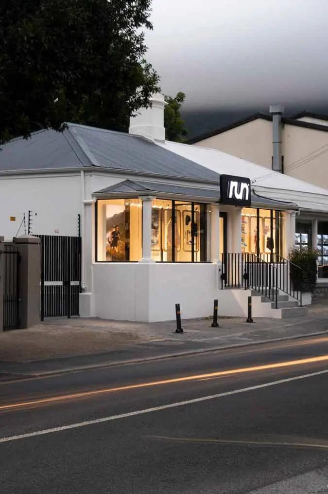
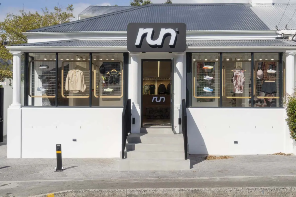
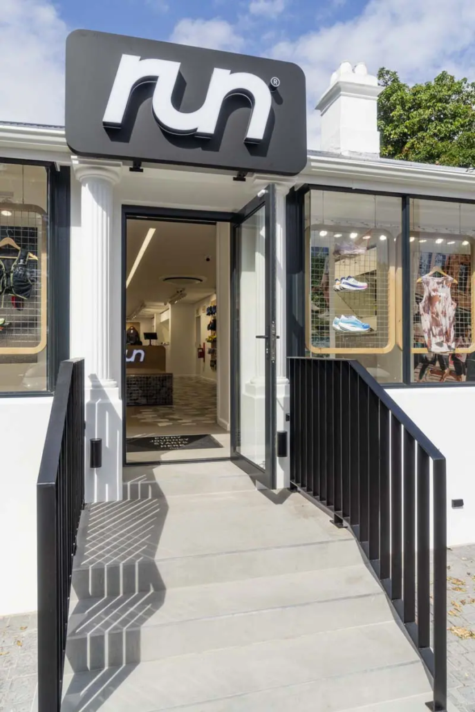
The client for the project is Branded Footwear Company, based in the Western Cape. The new Run store is located on Kildare Road in Newlands, a well-known retail strip that has gradually evolved from residential origins into a mix of commercial and boutique retail spaces. The store occupies approximately 250 m².
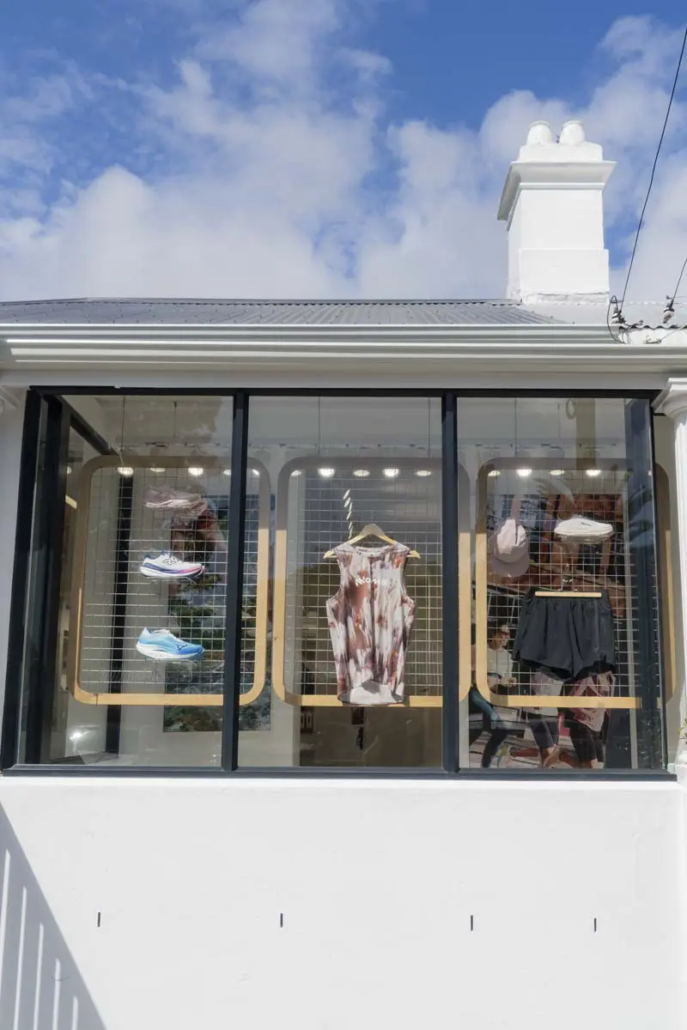
The property itself has an interesting history. The building was originally a house and remains one of the earlier structures on the street. From the exterior, its residential origins are still evident most notably in the central chimney feature, which historically served two living rooms on either side of the house. Over time the property was sectionalised, with the Run store occupying the left-hand portion of the original structure.
The site was purchased in 2023, but a considerable amount of preparation was required before construction could begin. This included navigating heritage considerations associated with the building, as well as carefully managing the process of adapting a residential structure for modern retail use.
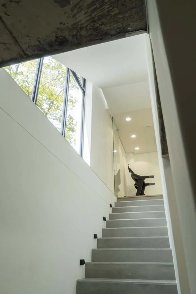
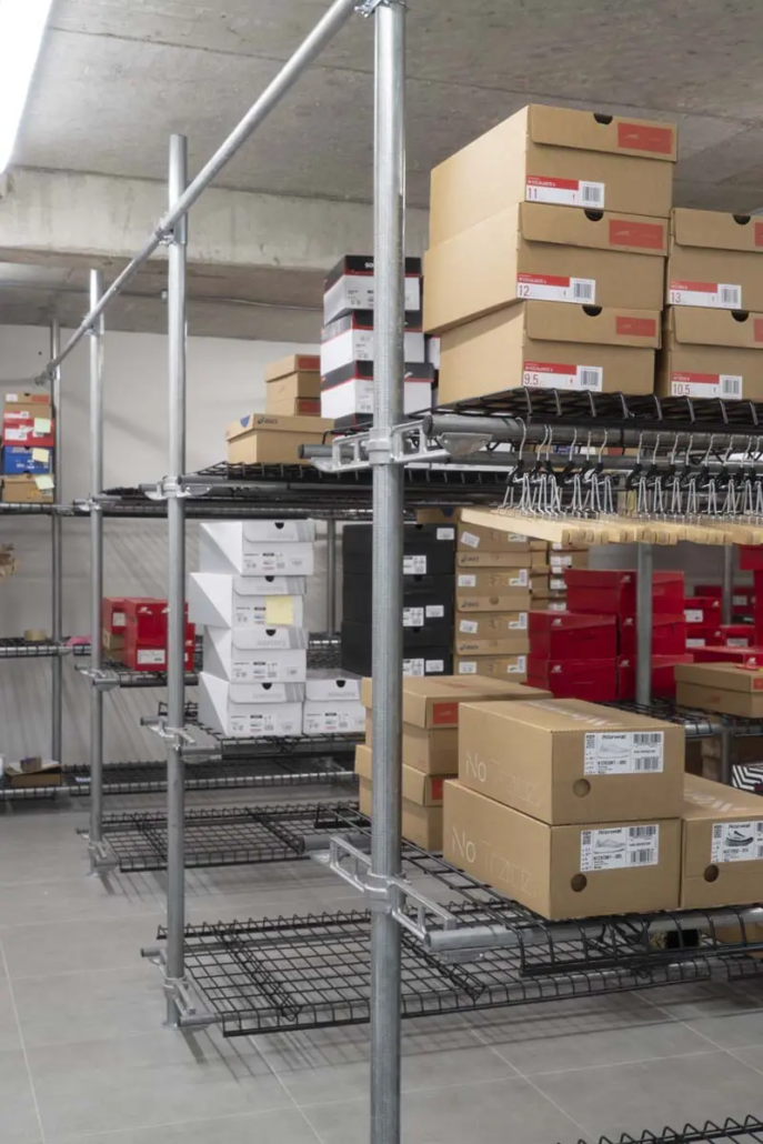
Originally, the building consisted of a relatively small pitched-roof structure with an undeveloped backyard. The architect on the project, Bruce Baumiester, proposed a thoughtful intervention that fundamentally expanded the capacity of the building without compromising its street presence. His design introduced a large basement level beneath the retail floor, which now serves as storage and operational space for the store.
Creating this basement required a carefully sequenced construction process. Excavation needed to be completed before the arrival of the Western Cape’s winter rains, which are known for their intensity. The construction team worked under considerable time pressure to complete the excavation, cast the retaining structure, and install the slab roof before the rains arrived. Their ability to achieve this was a commendable piece of project execution and ultimately safeguarded the site from potential flooding during the winter season.
Evolving the Retail Language
While the underlying concept of the Run brand was already strong, my objective with the new store was to elevate the material language and overall spatial experience.
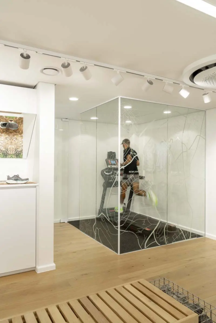
The guiding idea was to use durable construction materials, but apply them with a higher level of refinement and precision. The intention was to create a retail environment that felt more open, brighter, and visually energised.
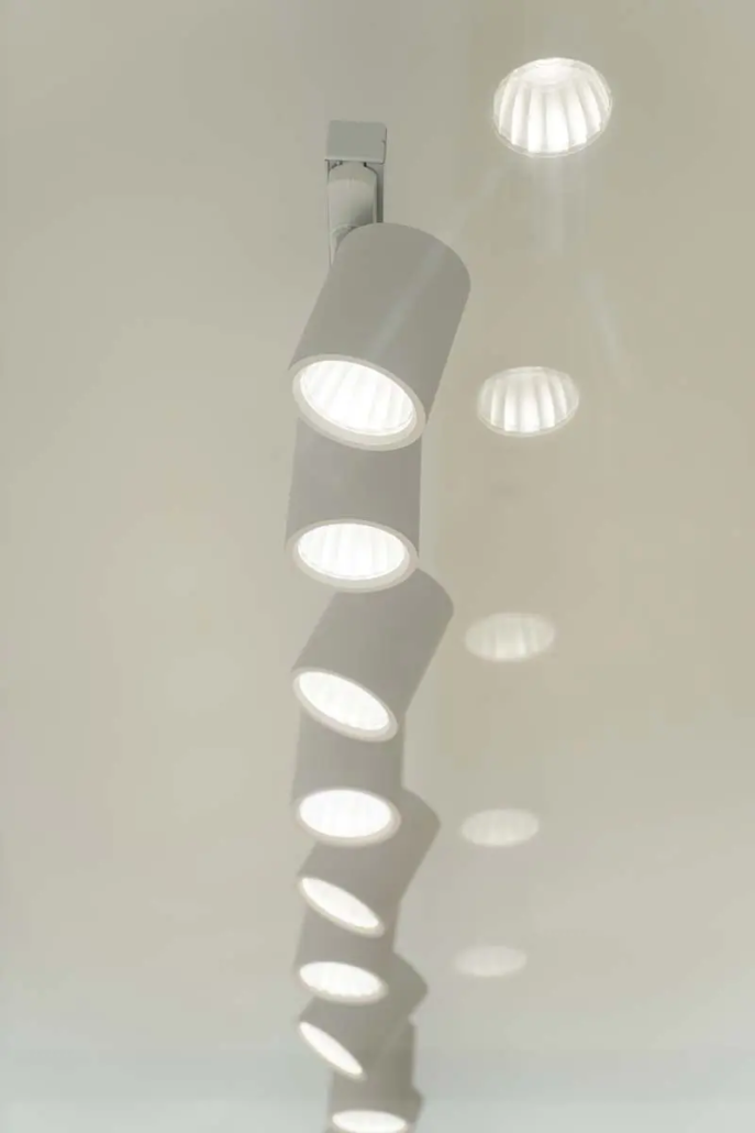
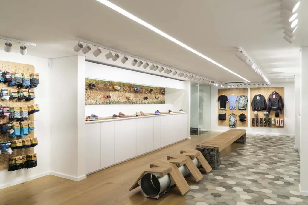
One of the most important changes was the lighting strategy. From observing the previous stores, it became clear that lighting levels were slightly too subdued for a product-focused retail environment. Running shoes today are highly considered objects both technically and visually and they benefit from being seen in the right light.
In this store, I placed a strong emphasis on achieving consistent, adequate lighting throughout, calibrated around a neutral colour temperature. The goal was not to create drama, but rather clarity allowing the product to speak for itself.
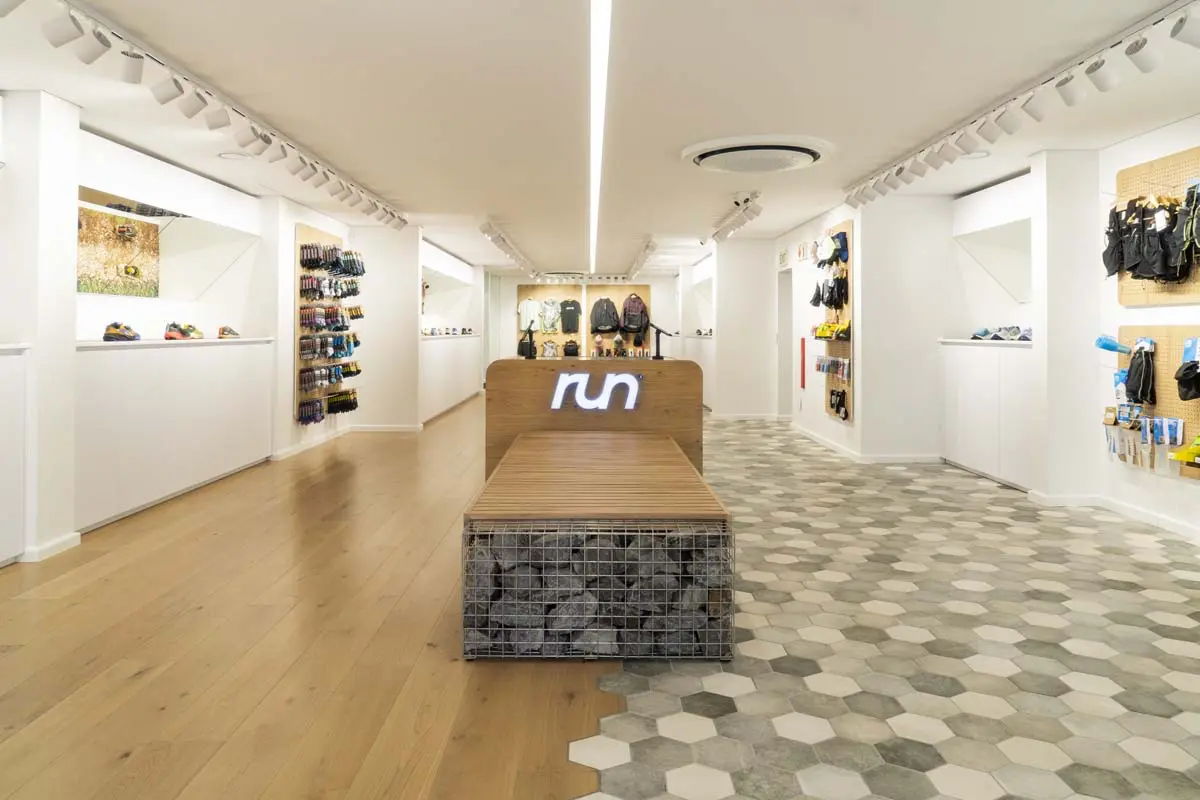
The central spatial gesture of the store is expressed through the two floor finishes, which reinforce the distinction between trail and road running.
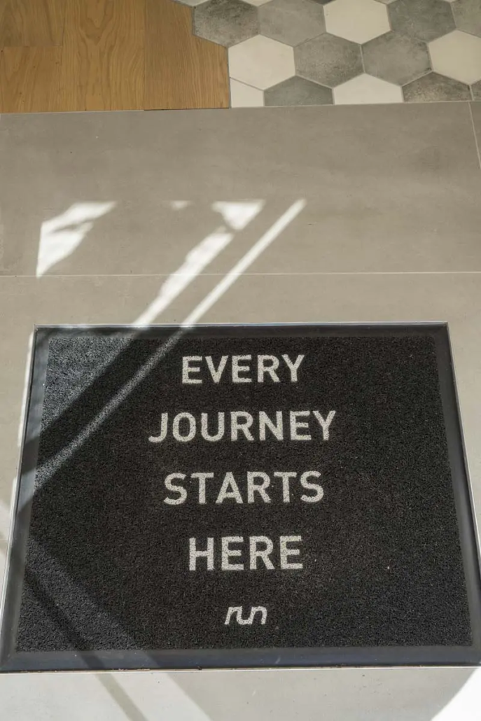
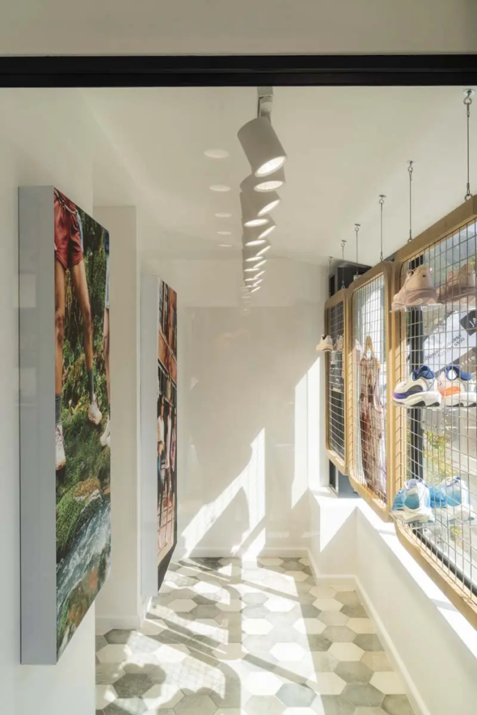
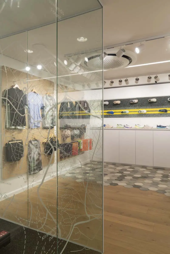
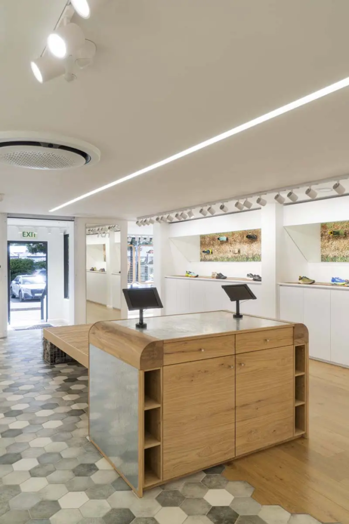
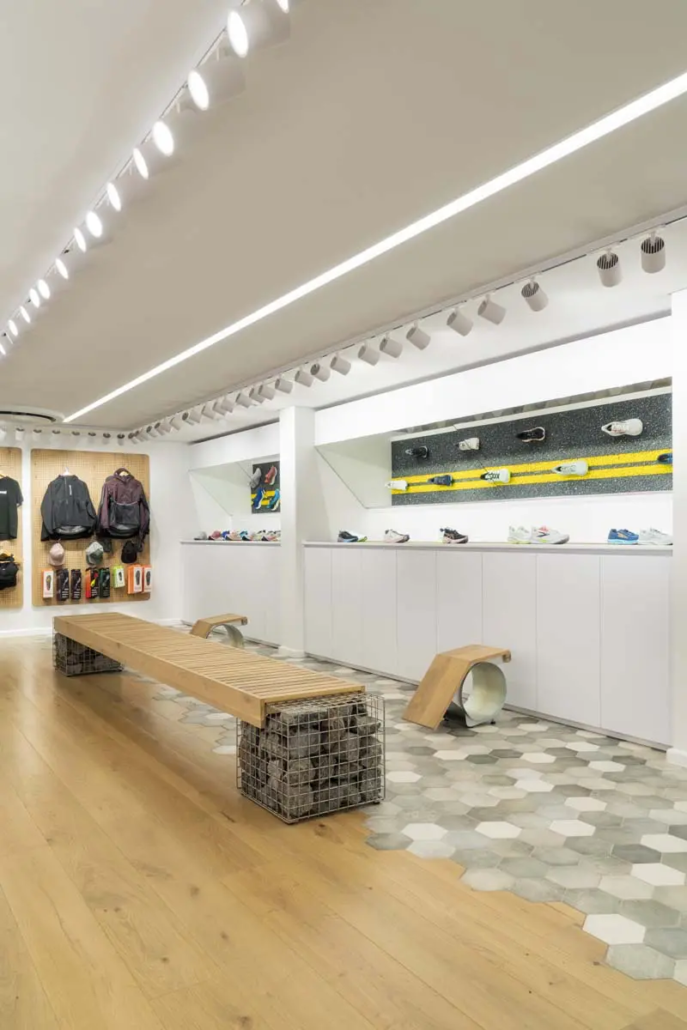
The trail section is finished in a warm oak timber floor, referencing the natural terrain associated with trail running. The road section uses a mottled grey hexagonal tile, evoking the texture and colour of tarmac.
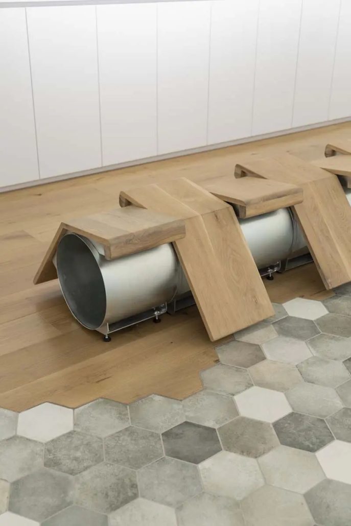
The transition between these two materials became one of the most technically interesting aspects of the design. Rather than using a straight dividing line, we developed a flowing interface between the timber and tile. The hexagonal geometry dissolves into the timber flooring in a gentle wave that runs from the front of the store through to the back. The result is a natural, almost geological transition between the two surfaces. This dividing line is echoed in the ceiling through a recessed LED light channel, subtly reinforcing the spatial split while maintaining visual cohesion across the space.
Working Within an Existing Structure
One of the defining constraints of the project was the relationship between the existing structure and the new addition. Rather than working with a single, aligned shell, the space presented a more complex geometric condition. The original building and the new extension effectively formed two rectangular volumes that were not parallel, sitting approximately 11 degrees off one another. Resolving this misalignment became a critical part of the project. In order to create a cohesive retail environment, the decision was made to visually straighten the space, aligning the old structure with the geometry of the new. This required extremely precise setting-out on site. Using a laser level, I established new reference lines that would guide the positioning of all drywall elements and internal planes. It was a meticulous and, at times, high-pressure process. Small errors at this stage would have compounded throughout the build and become immediately visible in the final space. Getting these lines right was fundamental to the success of the project. Once resolved, the geometry allowed the store to read as a single, unified environment, rather than two competing volumes. At the same time, the introduction of the basement level fundamentally changed how the store could operate. By relocating storage and back-of-house functions below the retail floor, we were able to keep the ground plane clean, open, and entirely customer-focused.
Material Decisions & Practicality
While the original concept behind the Run stores was strong, certain material applications proved to be less practical over time. In particular, the previous floor execution, although conceptually aligned with the brand, did not fully accommodate the realities of foot traffic and long-term durability. For the Newlands store, this was addressed by selecting finishes that retained the conceptual intent while being more robust and serviceable in a high-traffic retail setting.
The Shoe Display System
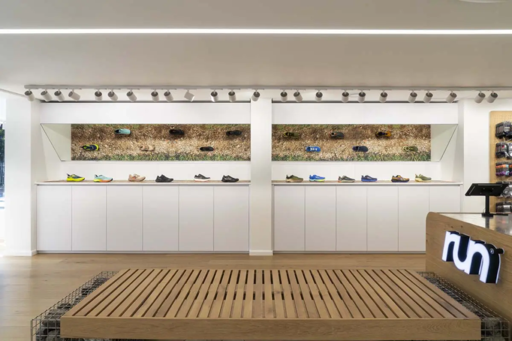
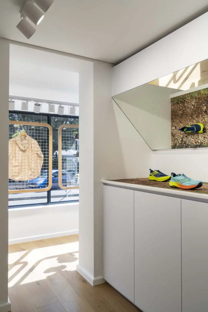
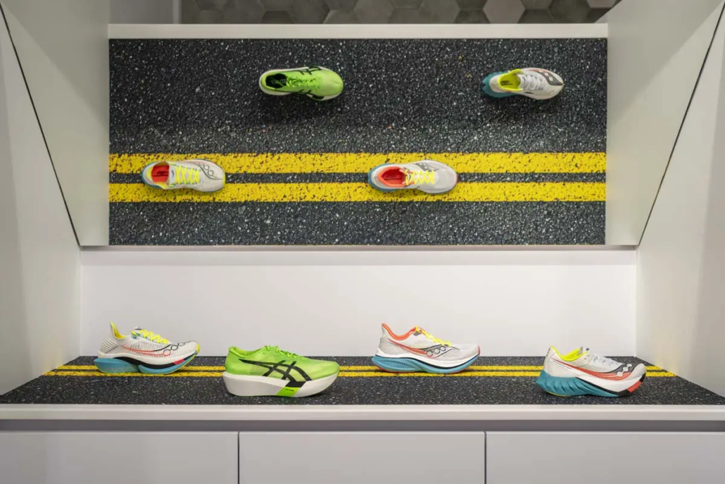
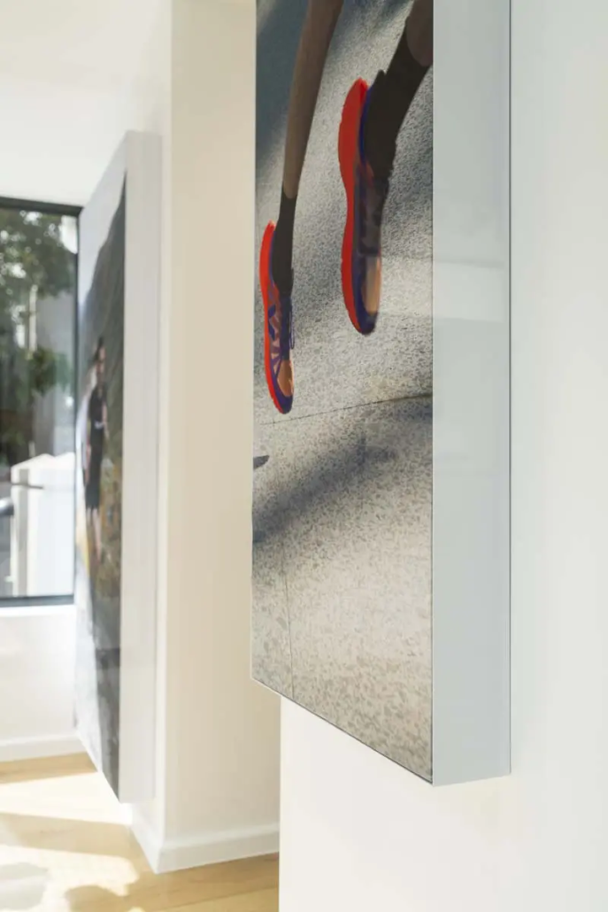
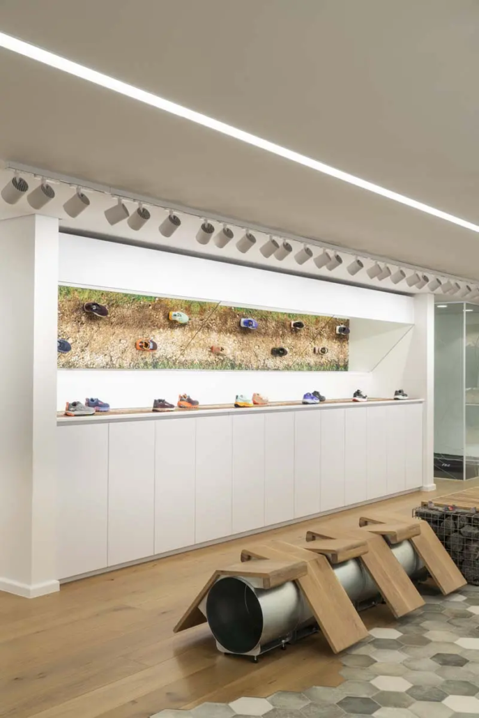
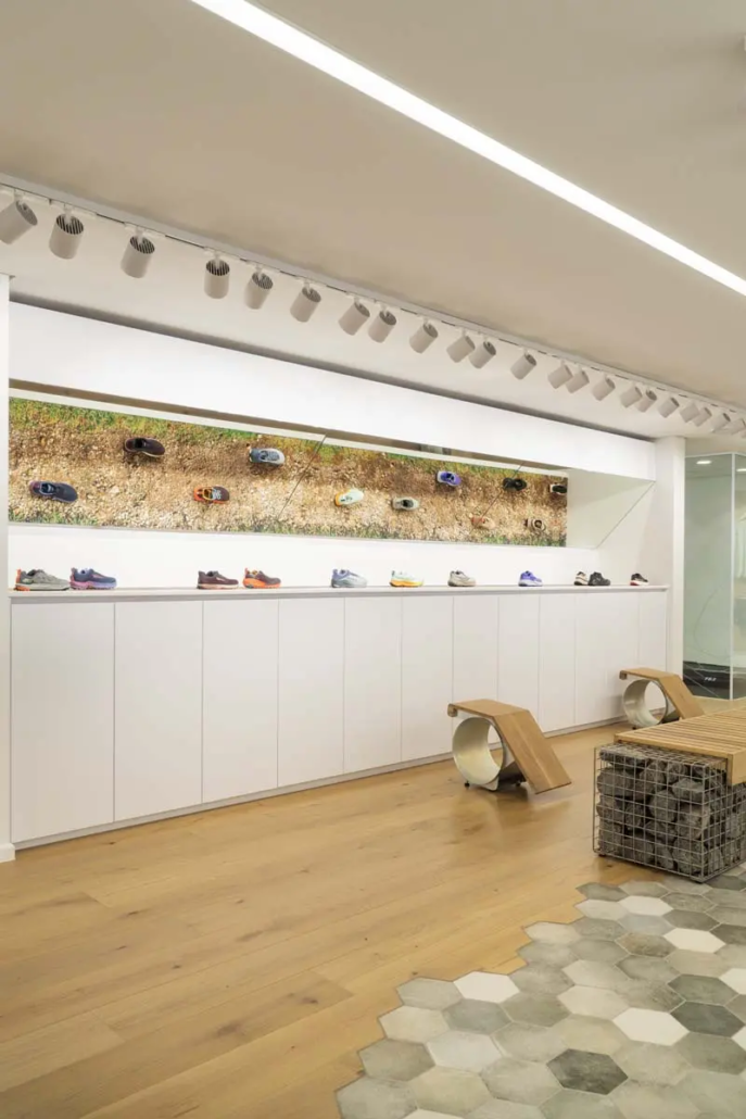
The focal point of the interior is the series of white joinery display units that line the store. These units were designed to present the shoes in a way that is both visually striking and ergonomically intuitive. Each display integrates a 45-degree mirror positioned behind the shoe. The shoes themselves are placed slightly above waist height, allowing customers to easily pick them up and examine them comfortably. The mirror performs two functions. First, it reflects the shoe from multiple angles, allowing the customer to see the top, side, and back simultaneously. Second, it reflects a custom artwork panel located at the base of the display. These artwork panels depict the environments associated with each shoe category tarmac for road running and single-track trail for trail running. When viewed through the mirror, the shoe appears visually situated within its natural terrain. The result is a display system where, from almost any vantage point in the store, the customer sees a layered composition of product, reflection, and environment.

Programme & Project Risk
As with most retail projects, timing was a critical driver. The store needed to be completed ahead of the December trading period, placing firm pressure on both the design resolution and the construction programme. Missing this window would have had a direct impact on the commercial performance of the space. At the same time, the project carried a significant level of responsibility. The store represents a major investment and forms part of a broader evolution of the Run brand over time. Balancing programme, budget, and design intent therefore became a constant exercise throughout the build. Decisions needed to be made quickly, but not at the expense of the overall outcome. Maintaining that balance between pace and precision was a key part of delivering the project successfully.
Lessons From the Build
As with any construction project, alignment with the broader build programme is critical. Retail projects in particular are rarely isolated they exist within a larger ecosystem of timelines, approvals, and dependencies. While there were the usual pressures and delays inherent in construction, maintaining momentum on site became a key priority. In practice, this meant taking a hands-on approach to coordination, often stepping beyond the immediate scope of design to ensure that decisions were made quickly and progress was not lost.
The objective was simple: keep the project moving forward and maintain the integrity of the end result.
A Personal Connection to Place
This particular project carried a level of personal significance for me. Newlands is close to home, and it’s a place I move through regularly — often as the starting point for my own runs and longer outings. The site itself has a unique outlook, with views toward the Fernwood amphitheatre, a part of the mountain I’ve spent a considerable amount of time climbing. It’s one of the few vantage points in the area where the full face reveals itself through the tree line. There were many moments on site where I found myself looking up at the mountain, thinking about conditions on the routes, or what it would feel like to be up there at that exact time.
Opening Day
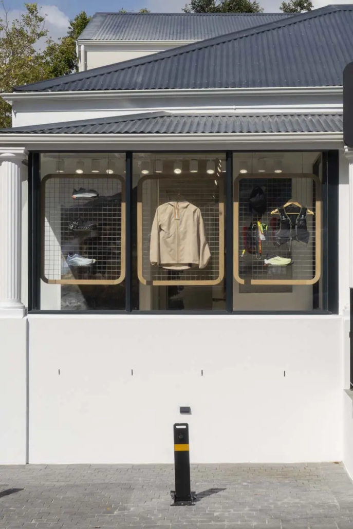
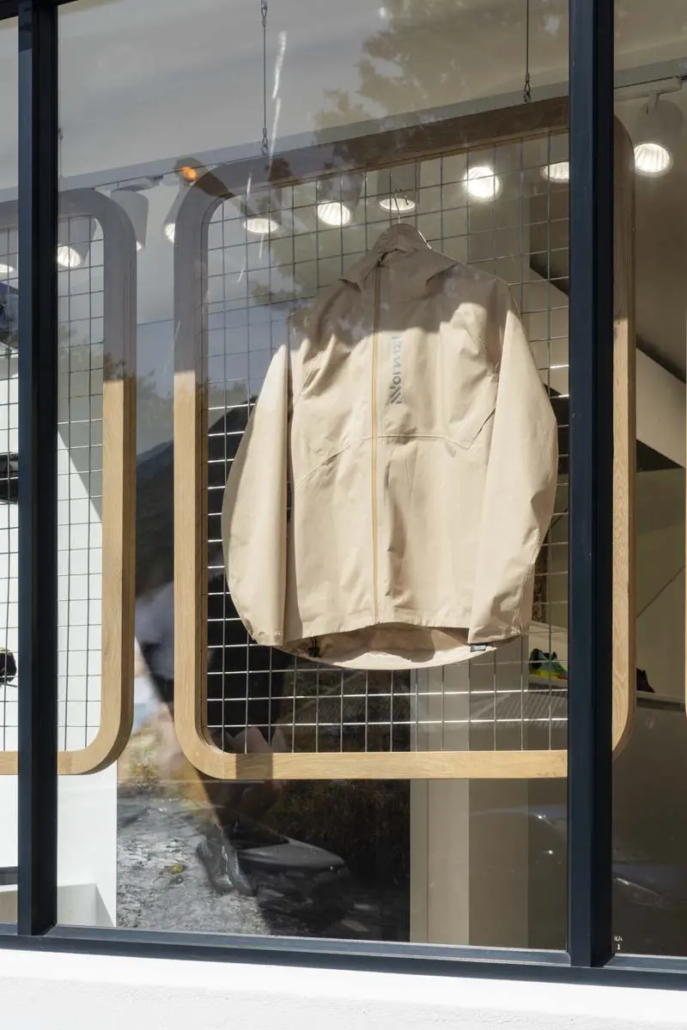
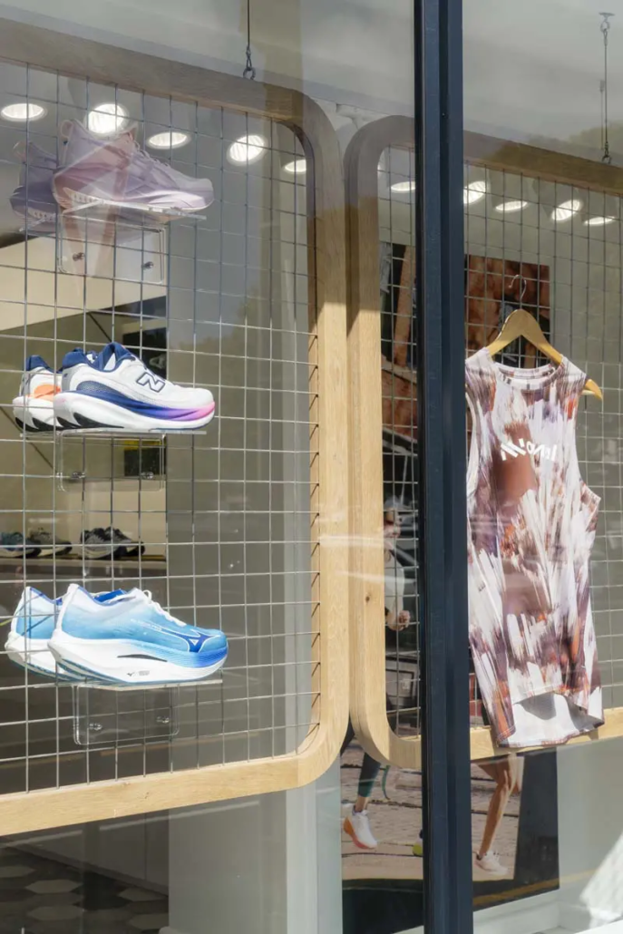
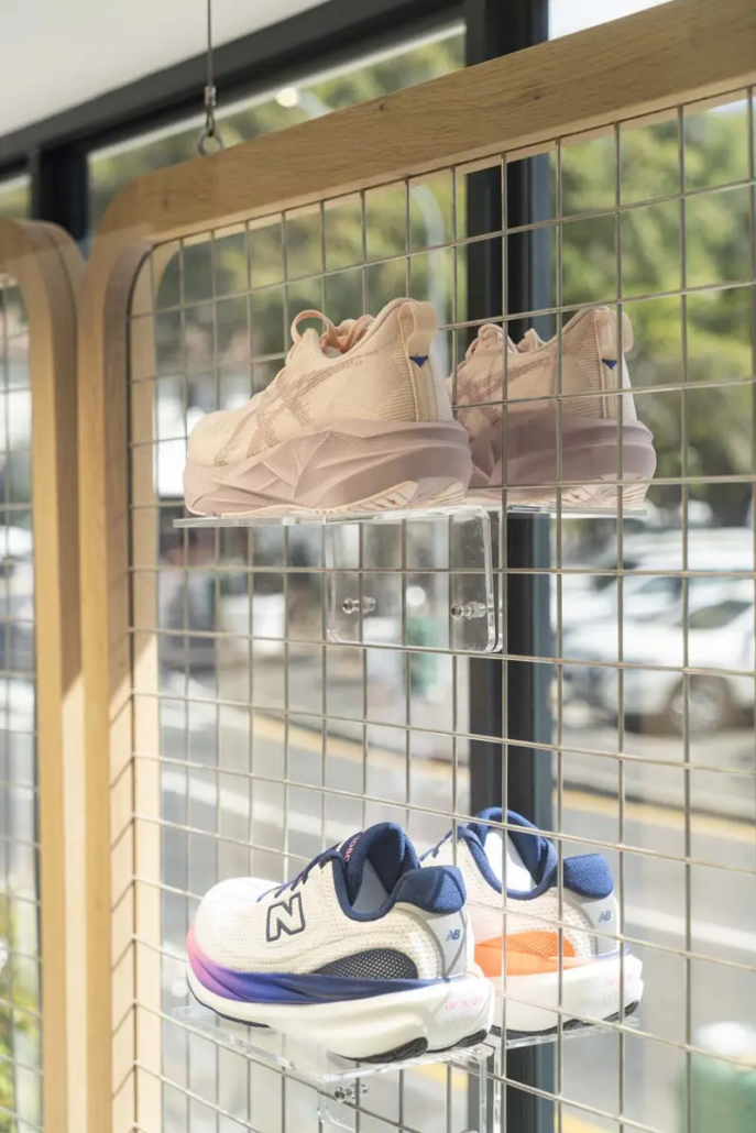
The impact of the store became immediately apparent on opening. As the hoarding came down and the windows were revealed, the space drew attention in a way that was hard to ignore. The site experiences a high volume of passing traffic, and it wasn’t uncommon to see drivers slow down or even momentarily stop to take in the space. There was a visible sense of curiosity and, in some cases, genuine surprise. Moments like that are always rewarding. They signal that the space is doing something right not just functioning as a store, but contributing something new to its surroundings.
Final Reflection
At its core, this project was about refinement rather than reinvention. Taking an already strong retail concept and elevating it through better material choices, clearer spatial definition, and more considered execution. The intention was to create a space that feels intuitive to navigate, honest in its materiality, and focused on the product above all else.
In retail, clarity is not a luxury, it’s a requirement.
More broadly, it reflects the kind of work I aim to deliver practical, resolved, and quietly confident.
I’m excited to see how the store performs over time and how the space continues to evolve as part of the Newlands retail landscape.